Keynote's awesome Outline Mode
So, I love Keynote.app. It’s one of my all-time favorite apps. During my time at Apple, I got to use the app a lot and was constantly amazed by how powerful and capable it is. I grew very used to its precision and elegance, and its overall ease-of-use.
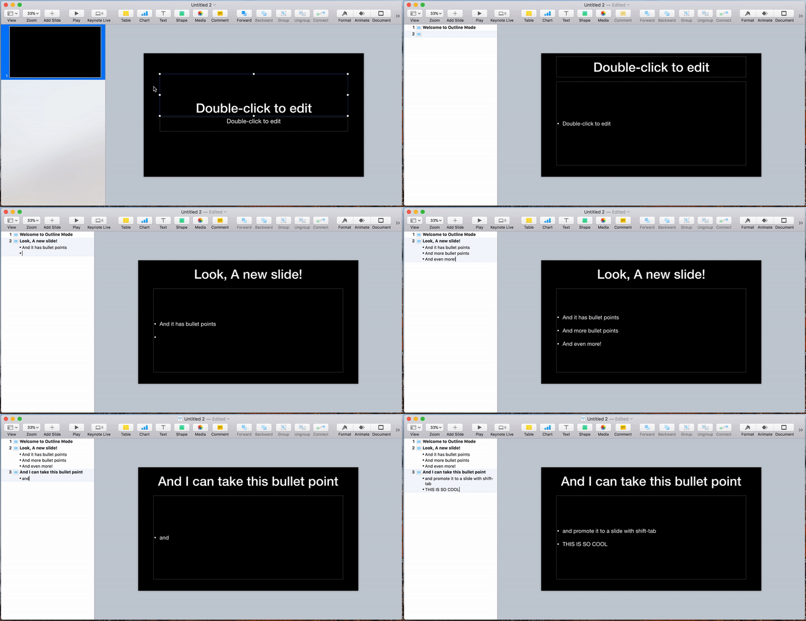
One of the really cool tricks I learned about Keynote was to quickly build slides using Outline Mode, like so:

Outline mode is a powerful way to build slides, because it allows you to focus on the structure and flow of your content, without getting distracted too much by the visual aspect. In the early phases of building a deck, this is really important.
However… the visual aspect is still there. There are these huge slides sitting right next to your outline and you cannot make them go away. It is really easy to get distracted from what you’re doing and start focusing on text alignment, font sizes, animations, slide styles, and so on.
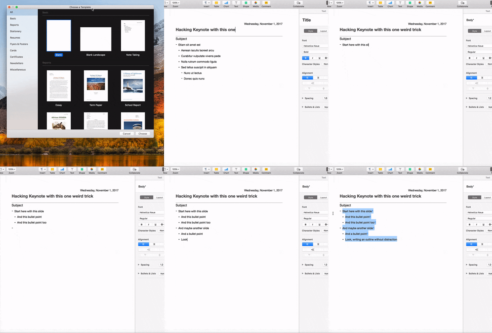
This morning I had the idea of “well, what about other outline modes, like the one in Pages?”. So I popped open Pages and started writing an outline and copied it to my pasteboard:

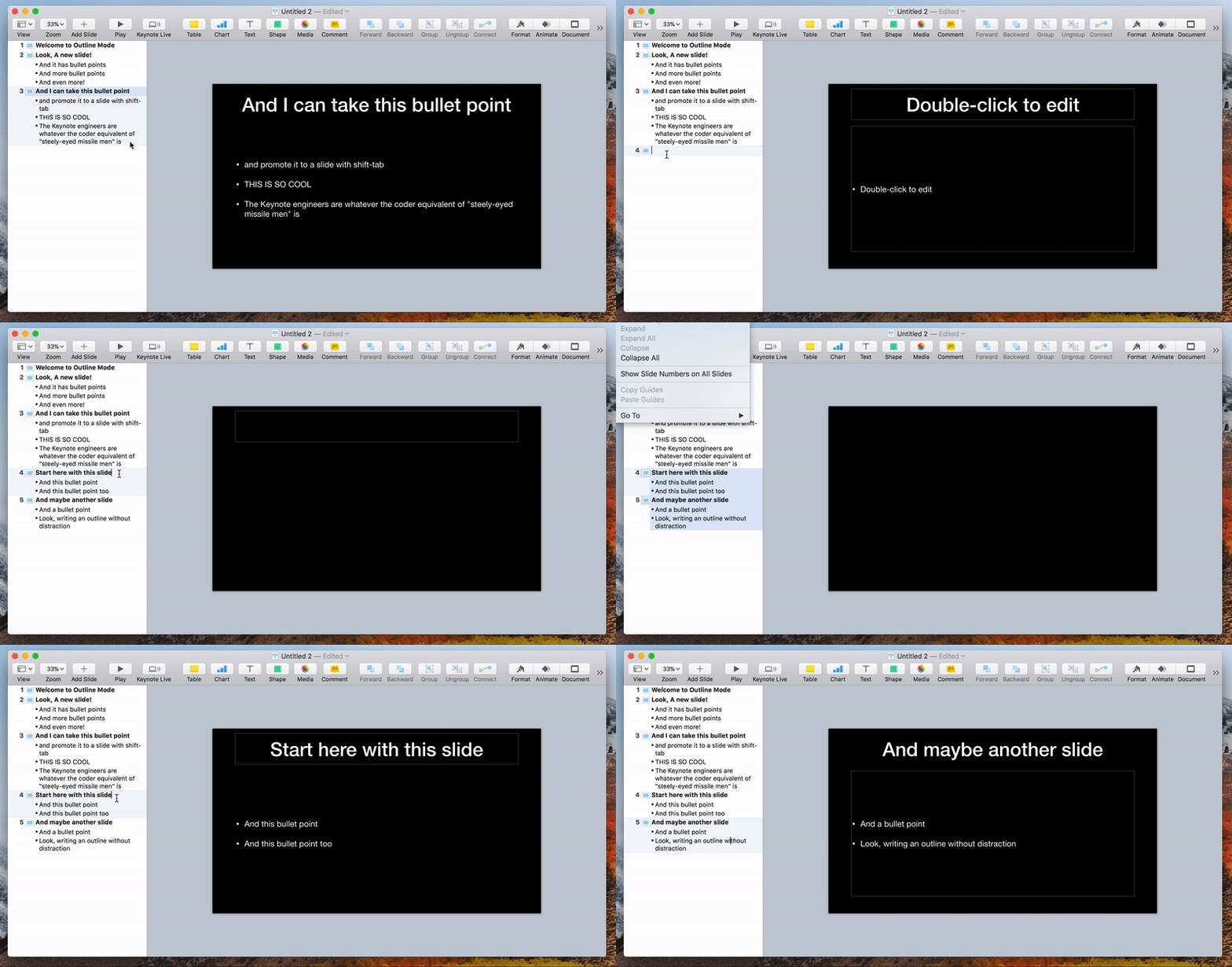
With this outline in hand (er, on my pasteboard), I headed back to Keynote and tried pasting it into the Outline view:

A couple clicks to make sure the slides had the proper style (by reapplying the master style to the slides), and I had generated an entire presentation in a matter of seconds. At this point, with an outline built, I can easily create my Keynote presentation and start polishing it and adding in all the visual fanciness.
If you build presentations but get distracted by the slides, this could make your life a whole lot easier.