A Better MVC, Part 3: Fixing Massive View Controller
Part 3 in a series on "fixing" Model-View-Controller:
- A Better MVC, Part 1: The Problems
- A Better MVC, Part 2: Fixing Encapsulation
- A Better MVC, Part 3: Fixing Massive View Controller
- A Better MVC, Part 4: Future Directions
- A Better MVC, Part 5: An Evolution
The principle behind fixing Massive View Controller is to unlearn a concept that’s inadvertently drilled in to new developers’ heads:
1 View Controller ≠ 1 screen of content
From our very first iOS apps, we’re taught the idea that 1 view controller == 1 screen of content. We see this in every simple “make a list and push a detail view” app. However, as our apps grow in complexity, so do our screens of content, and the default notion that 1 view controller == 1 screen of content quickly leads to Massive View Controller.
We can save ourselves from Massive View Controller by realizing that a view controller “controls a view” and that view doesn’t have to fill the screen.
Example: The WWDC App
Disclaimer: While I used to be the lead engineer on the WWDC app, I have not seen the code in quite some time and do not know if it is actually implemented this way. I am simply describing how I would build the screen if I were to build it today.
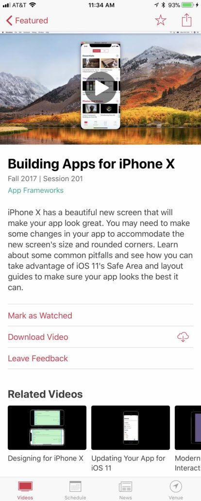
Here’s a screenshot of the WWDC app:

On this one screen, there are five main pieces of content:
- The video
- The title
- The description
- The contextual actions
- The related content
There is a lot going on here, and if this were to be implemented as a single view controller, it would be a massive view controller.
So, let’s not do that.
Instead, we’re going to make each one of those 5 areas its own view controller, all contained within the SessionDetailsViewController. The outer details view controller will own the general layout of the screen, as represented by some empty container views. These will all be in a UIScrollView that manages its content bounds through auto layout.
The SessionVideoViewController would be in charge of loading up the appropriate poster frame for the video and responding to the user tapping the play button. When the user taps that button, the view controller will delegate out that the user intends to watch the video. The parent SessionDetailsViewController can then pass that intention up the chain until it arrives at a semantically appropriate level for that intention to be translated in to the corresponding WatchVideoOperation.
The SessionTitleViewController and SessionDescriptionViewController will be pretty simple, since all they’ll have to do is observe the model object for changes and update the labels. There’s also no interaction to delegate back out.
The SessionActionsViewController would basically be a UIStackView of buttons. The buttons would be created based on inspecting the model object, and interacting with the buttons delegates back out the corresponding intention: “toggle favorite”; “leave feedback”; “begin download”; etc.
Finally, the RelatedSessionsViewController would be a side-scrolling collection view. Tapping on a related session would delegate back out that the user wants to view the session. The SessionDetailsViewController, as we learned in the previous post, would not be the one to perform that action, but would instead relay the intention up to a more semantically appropriate level (such as the view controller that owns the UINavigationController).
At the end of this exercise, we end up with more view controllers (six instead of one), but each one is relatively small. The video view controller loads a poster frame. The title and description view controllers observe the model for changes. The actions and related content view controllers are a little more complex, but each one is focused on a very specific set of actions, and neither is onerous to understand.
Example: The Reddit App
Disclaimer: I have no idea how the Reddit app is built.
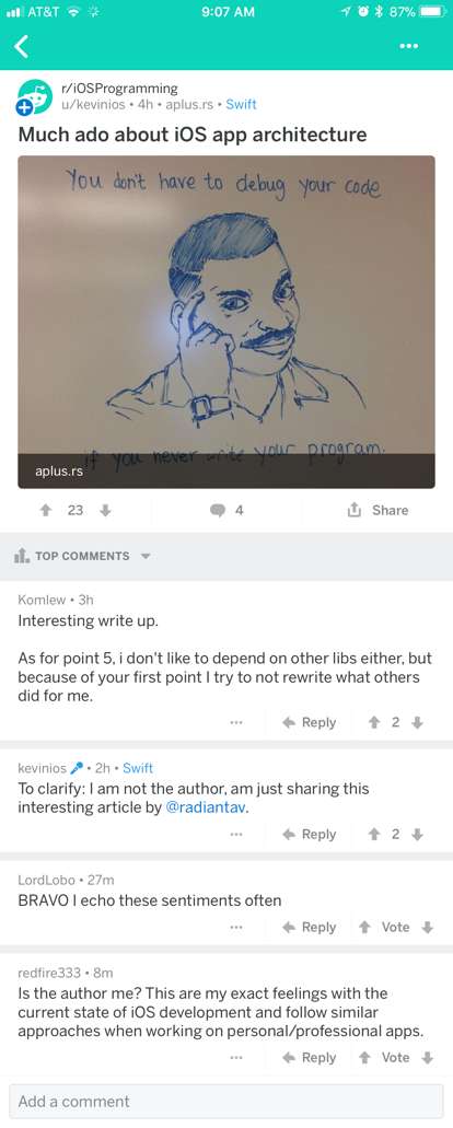
For this example, let’s take a look at the Reddit app.

There are a bunch of interesting things going on here, but I want to focus on the top part of this post screen that contains the actual post. A cursory survey through the app shows that there are several different styles that this post content can take, in addition to having a title:
- Text
- Link
- Animated gif
- Static image
- Video
It would be crazy to try and build the entire post page as a single view controller. At the very least, you’d want a “post content” view controller, and a “comments” view controller. But you can go further.
Imagine that the top post content is a PostContentViewController. You still have a large view controller as you have to handle one of these 5 different kinds of post content (showing all text vs loading a web preview vs animating a gif vs showing an image vs an inline video vs a link to an external video…).
So instead, make your PostContentViewController a “flow” view controller, and then have a different view controller for each kind of content. When you have a TextPostContentViewController, you never have to worry about dealing with loading callbacks. A LinkPostContentViewController only has to deal with loading a preview. A GIFPostViewController only ever has to load a gif. It’s easy, and you PostContentViewController just has to pick the right one, embed it, and then handle the odd delegation of user intent.
By combining both principles (view controllers as flow and small view controllers), you can easily decompose your UI in to small, manageable, testable, isolated, and grokkable chunks.